
Customer churn is the silent killer of SaaS growth. According to Sixteen Ventures, most SaaS companies lose between 2-8% of customers monthly, and compounding that over a year can crush your revenue trajectory.
That stat hit home for me in early 2025 when I sat down to review our SaaS retention metrics.
Growth was happening, but churn was eating away at our progress like termites in the foundation.
It wasn’t enough to look at vanity metrics anymore.
I needed to understand why people were leaving and when they started drifting away.
That’s when I doubled down on SaaS churn cohort analysis.
Here’s how I’m approaching this now, what I’ve learned so far, and why it might be the most important data deep-dive you do this year.
What Is SaaS Churn Cohort Analysis?
SaaS cohort analysis is a method of tracking groups of users over time who share a common characteristic, like the month they signed up or an action they took.

When applied to churn, cohort analysis lets you:
- Compare user behavior across different time periods
- Spot patterns that signal churn risk
- Uncover which features actually retain users
I break it down into two types:
1 - Acquisition Cohorts
These group users based on when they started using your product. By looking at these, I can answer:
- Are newer users dropping off faster?
- Have recent product changes impacted retention?
- Are we shortening the time-to-value?
2 - Behavioral Cohorts
These group users based on shared behavior, especially around churn events. This helped me discover:
- Which subscription plans retain better
- What actions users don’t take before canceling
- What high-LTV users do differently
Why I Use Churn Cohort Analysis Weekly
Retention is more of a feedback loop than a lagging indicator. Cohort analysis helps me pinpoint when users disengage, identify which parts of onboarding fail, and prioritize features that drive long-term usage.
I’m constantly reminded of the fact that 65% of a company’s revenue comes from existing customers (Harvard Business Review).
I can’t afford to guess when it comes to retention.
For example, one cohort revealed that users who didn’t enable a key integration in the first week were 40% more likely to churn by month two.
That insight led us to build an integration checklist in our onboarding, and retention in that segment jumped.
My Process For Running Churn Cohort Analysis
I use a cohort table (you can build one in Google Sheets or pull it from a tool like Mixpanel). It tracks how many users in each cohort remain active over time.
Here’s what I focus on:
- Rows = Cohorts (e.g., users who signed up in January)
- Columns = Time since signup (e.g., Month 1, Month 2, etc.)
- Cells = % of users still active (or churned)
When I see steep drop-offs in certain cohorts, I dig into:
- Time-to-value
- Feature activation
- Support tickets or NPS responses
I noticed that users who skipped our walkthrough were 3x more likely to churn in the first month. Now, we incentivize walkthrough completion with an onboarding reward, and completion rates have doubled.
Here Are Some Tools I Use & Recommend
I’ve relied on a lean technology stack to support my cohort analysis efforts. If you aren’t already, you should consider using the following:
Google Analytics (GA4)
Good for cohort tracking based on session data, basic retention metrics, and segmentation.
Raaft
Sure, I’m a little biased but Raaft is great for in-app cancellation flows and understanding why users churn. It gives qualitative insight at the point of cancellation (a goldmine).

I can look at users from different cohorts and immediately understand why they decided to churn.
Raaft simplifies everything and displays user data in a way that’s very intuitive.
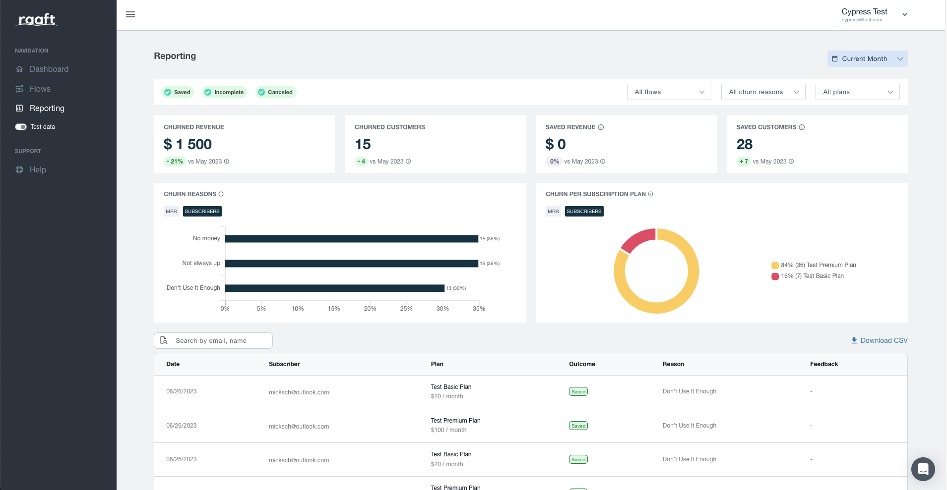
I could ask any of my non-technical team members to log into Raaft and they would easily pull up data for every SaaS cohort and gain an immediate sense of why churn is happening.
Mixpanel
Powerful for event-based cohort analysis. I use it to track behaviors like feature usage, email opens, and onboarding funnel progress.
Amplitude
Similar to Mixpanel, with great visualization tools for retention cohorts and product usage flows.
How I Use Cohort Data To Improve Retention
Once I’ve got the data, here’s what I do:
1 - Flag At-Risk Cohorts
I look for signs like 50% drop-off in Month 1 or abnormal time-to-value delays. These indicate friction or onboarding gaps.
2 - Map High-Retention Behaviors
What are our best users doing? Are they using a specific feature? Attending a webinar? We then work that into the onboarding journey for everyone.
3 - Build Feedback Loops
Raaft helps us gather cancellation reasons. Sometimes it’s not the product. It’s confusion, billing, expectations, or a mixture of all three. Knowing why people leave shapes both product and messaging.
You Need To Stop Guessing & Begin Segmenting
Churn hurts, but it also teaches.
I’ve always found this to be true.
When you zoom in on what’s happening within cohorts, not just your total churn rate, you unlock the why behind customer decisions.
As a SaaS founder in 2025, I want you to adopt the mindset of cohort analysis being essential to how you run your business.
If you’re not doing this yet, start small. Pick a tool. Run a basic acquisition cohort analysis. Look at your Month 1 retention. The insights will change how you build.
Raaft is the obvious place to begin.
Get started for free with Raaft and start understanding why SaaS users churn.

Offboarding Cheatsheet
This framework + video tutorial will help you design a better cancellation process.
Some of our featured articles


Miguel Marques

Miguel Marques

Miguel Marques
Customer Success insights in your inbox
Helping Founders and Customer Success Managers handle customer retention effectively.
We will only ever send you relevant content. Unsubscribe anytime.