The most successful SaaS companies understand the importance of churn as a growth lever.
For that reason, they all implemented custom cancellation flows, which provide them with better cancellation insights, reduce churn and inform product strategy.
This article provides an overview of the cancellation flows used by Spotify, LinkedIn and Adobe.
Example 1: Spotify Cancellation Flow
Step 1
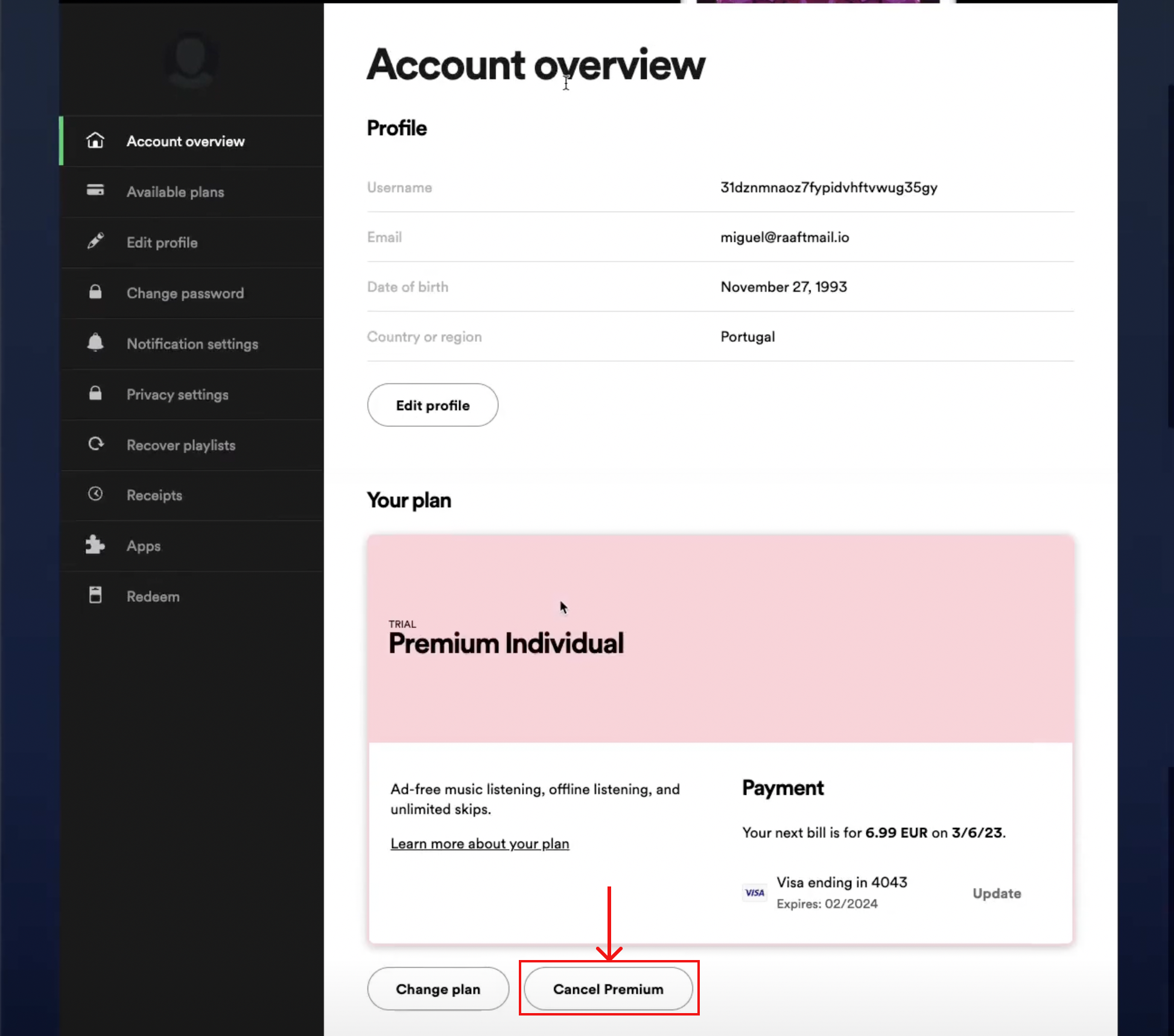
It's relatively simple to find the "Cancel Premium" option on Spotify's Account page.
They also clarify the next billing date and amount.
Step 2
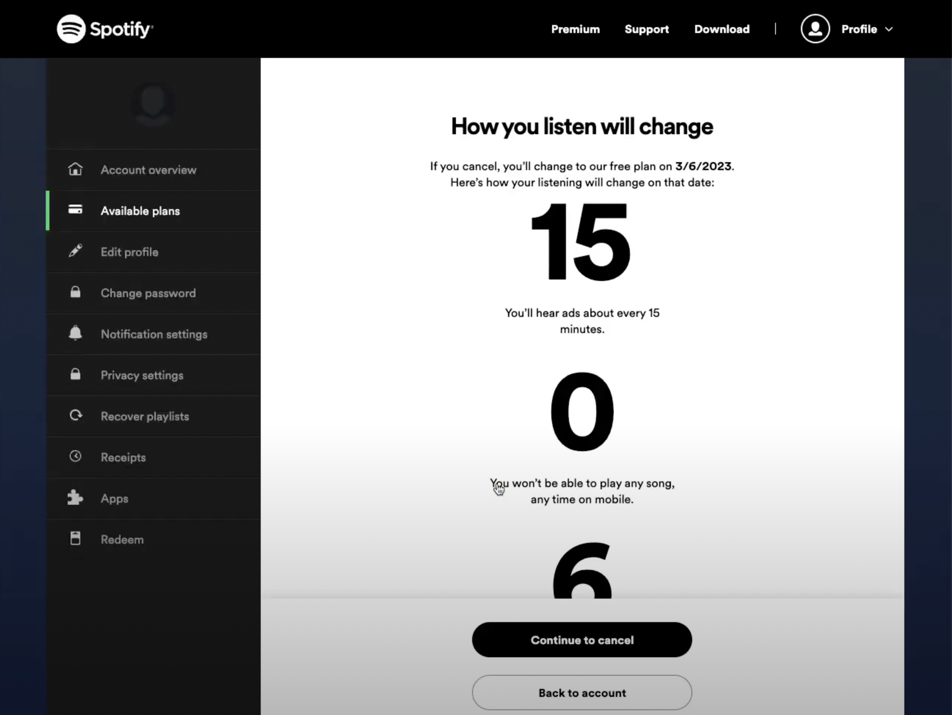
Once I click "Cancel Premium" I'm redirected to a Loss Aversion page. This page highlights what I will lose if I downgrade to the Free account type.
Step 3
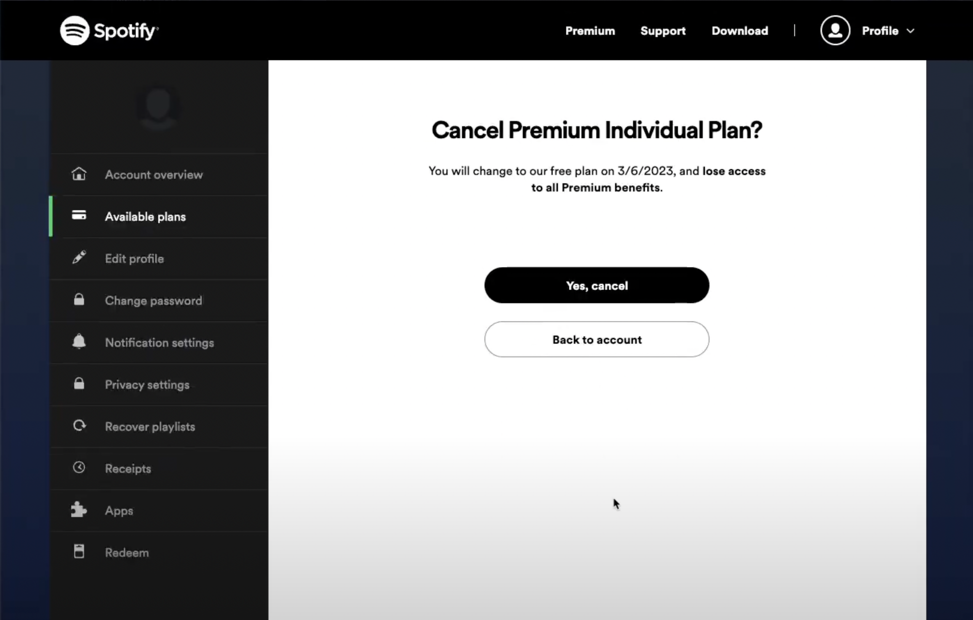
This step repeats what I've seen in the previous screen. This is a missed opportunity for another offer with a higher chance at retention (ex: 25% off for the next month if you stay).
Step 4
This step includes a survey on cancellation reason. Usually the survey with the churn reasons should come before users cancel - and not after.

Overall, this is a solid effort by Spotify. There is some margin for improvement, but they follow some of the industry best practices.
Pros
- Loss Aversion
- Easy to find
- Easy to complete
Cons
- Repeated step
- No churn reason required
- No retention offer
Check out the full video review of Spotify's Cancellation Flow if you're interested in a deep dive into this.
Example 2: LinkedIn Cancellation Flow
Step 1
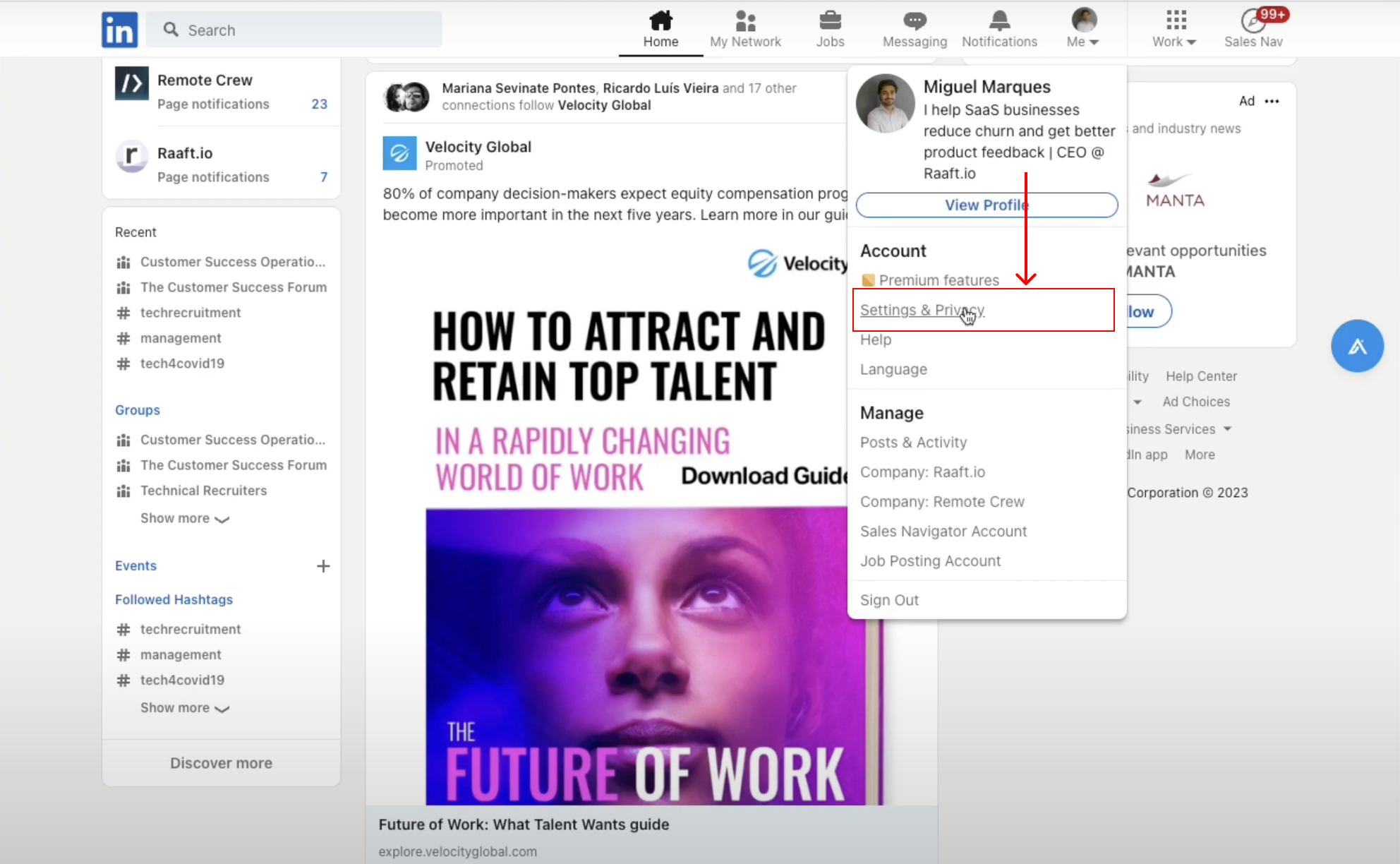
You need to click on Settings & Privacy to open that menu. Disclaimer: there might be other ways to get to account cancellation, this is the one that made sense for me.
Step 2
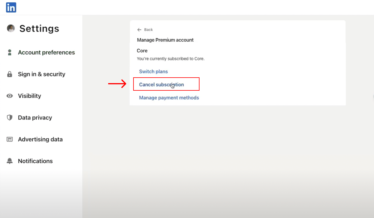
Inside Settings, I clicked Manage Premium account and then Cancel subscription. This step is pretty simple.
Step 3
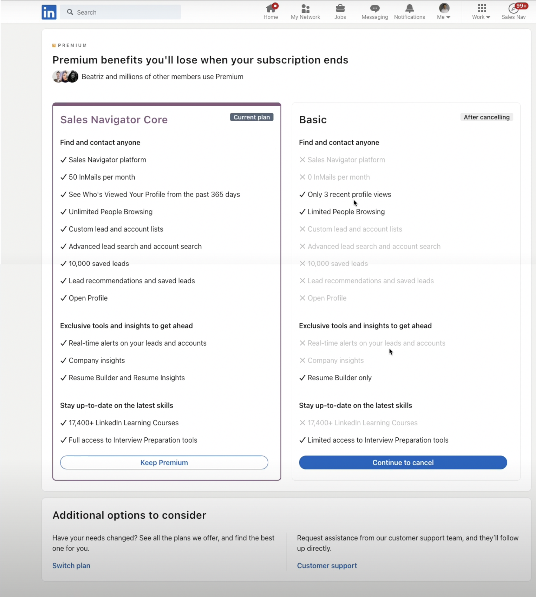
Step 3 is the standard Loss Aversion screen. It highlights what I have access to in my current plan and what I will lose if I Continue to cancel.
I like that they offer these additional options at the bottom. If you're open to switching plans or looking for support this would be a decent retention tactic.
Step 4
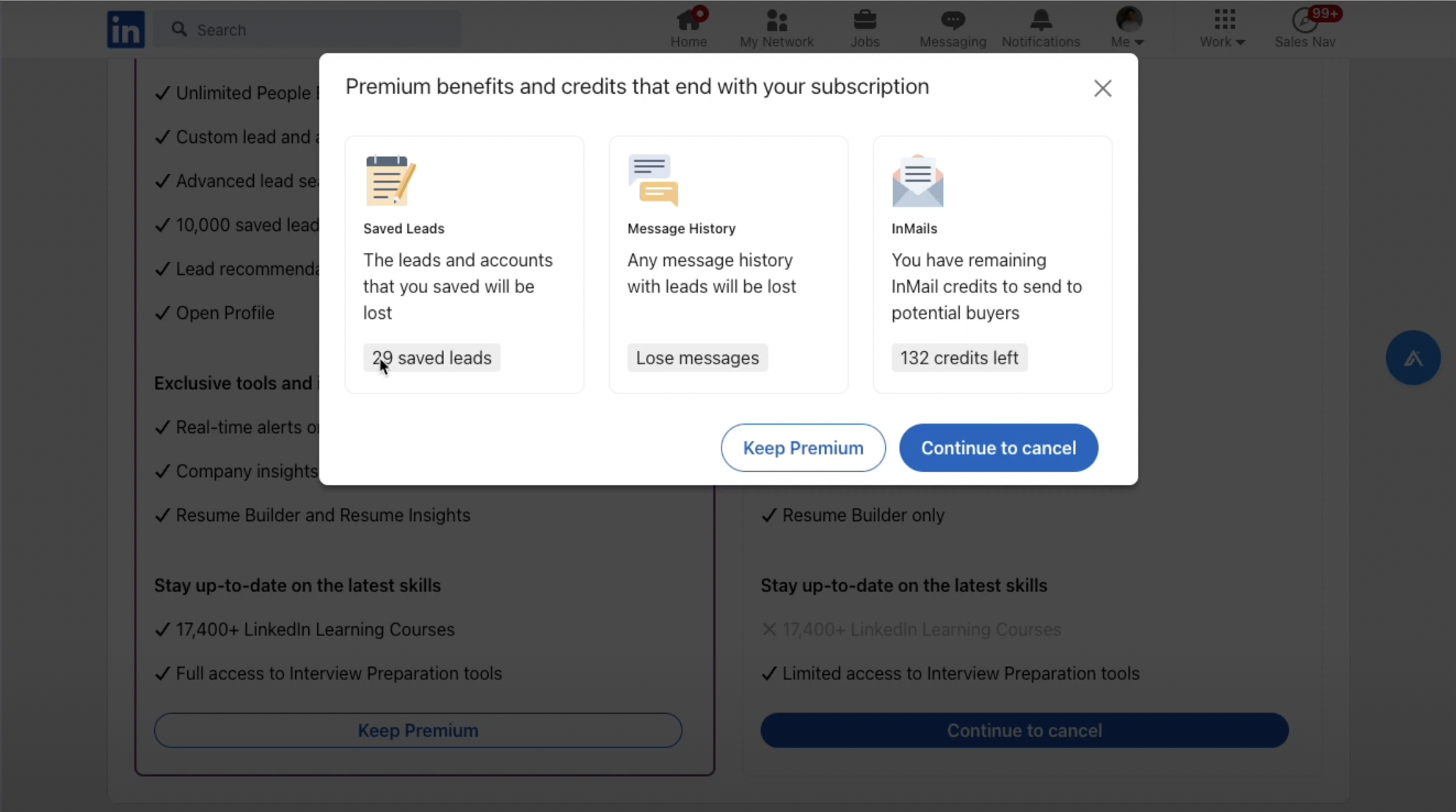
Step 4 is another Loss Aversion modal. It also shows your account usage and shows you exactly what you'll lose (ex: "29 saved leads", "132 credits left").
Step 5
This step is the churn reason survey. It's great that LinkedIn asks for the churn reason - but it doesn't ask or encourage additional feedback.

Step 6
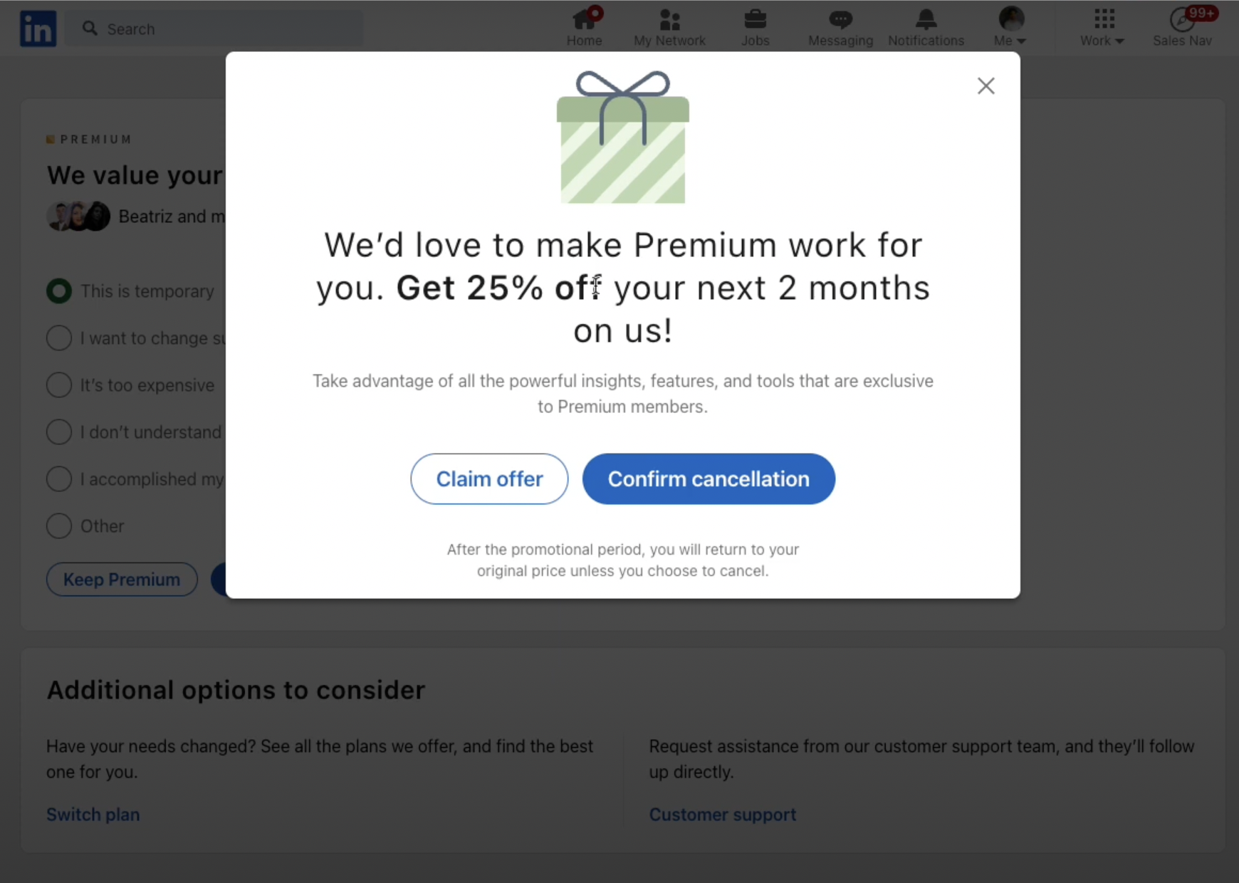
This is the final step in the cancellation flow.
At the moment of cancellation, there is one final offer: 25% off for 2 months. At this final stage, for users who are on the fence this is often a useful incentive.
LinkedIn offers a great offboarding flow. It's one of the most complete examples in the market and pretty effective at retaining users.
Pros
- Loss Aversion
- Churn Reason Survey
- Discount Offer
- Switch Plans
Cons
- No option to provide detailed feedback
Check out the full video review of LinkedIn's Cancellation Flow if you're interested in a deep dive into this.
Example 3: Adobe Cancellation Flow
Step 1
It's pretty simple to figure out where you should go to cancel your account. In the Overview menu, click on Manage Plan in the main section.

Step 2
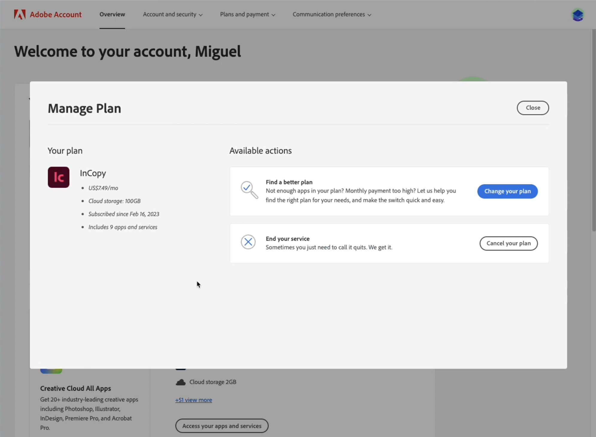
Inside Manage Plan, you are presented the option to Change your plan before you even say you want to cancel. I went ahead and clicked Cancel your plan.
Step 3
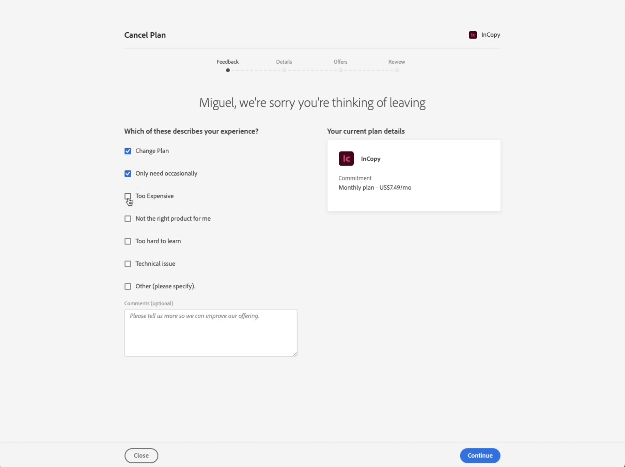
Step 3 is the churn reason survey. There's a small positive surprise here: users can select multiple churn reasons.
Step 4
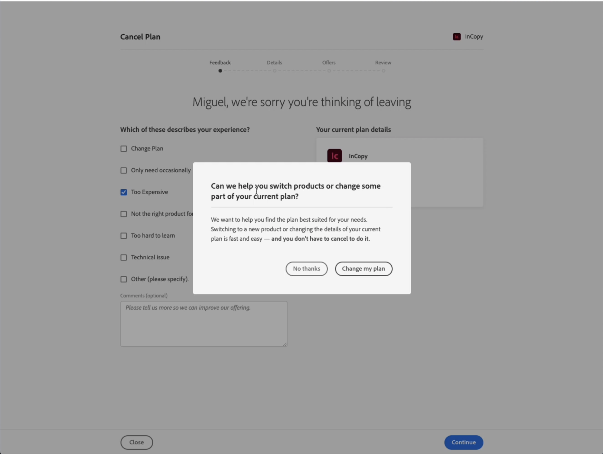
Step 4 is another offer to change plans. This pop-up is the least useful part of the offboarding flow.
Step 5
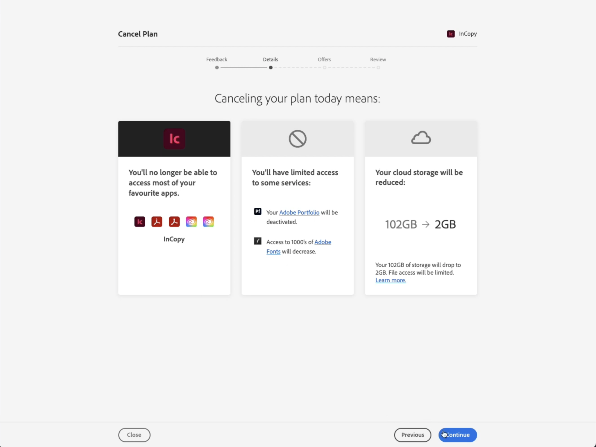
This step is the Loss Aversion screen. Adobe does a great job at it.
They highlight 3 different elements you will lose if you cancel: you won't have access to paid apps, you'll have limited access to the free apps and less cloud storage.
Step 6
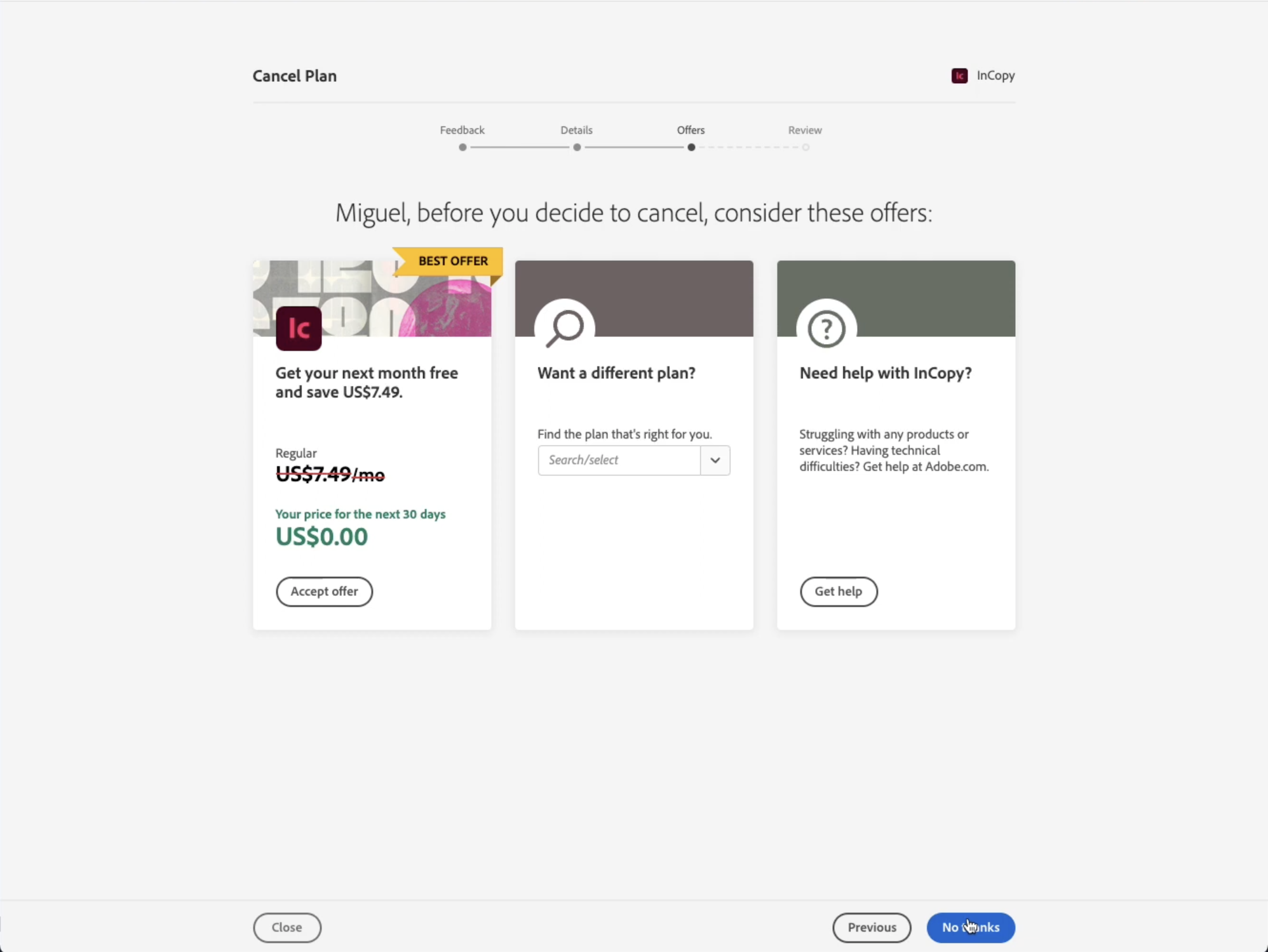
The offers step is the best part of the whole offboarding flow.
Before you cancel you are presented 3 different offers:
- Discount coupon
- Change plan
- Get support
Step 7
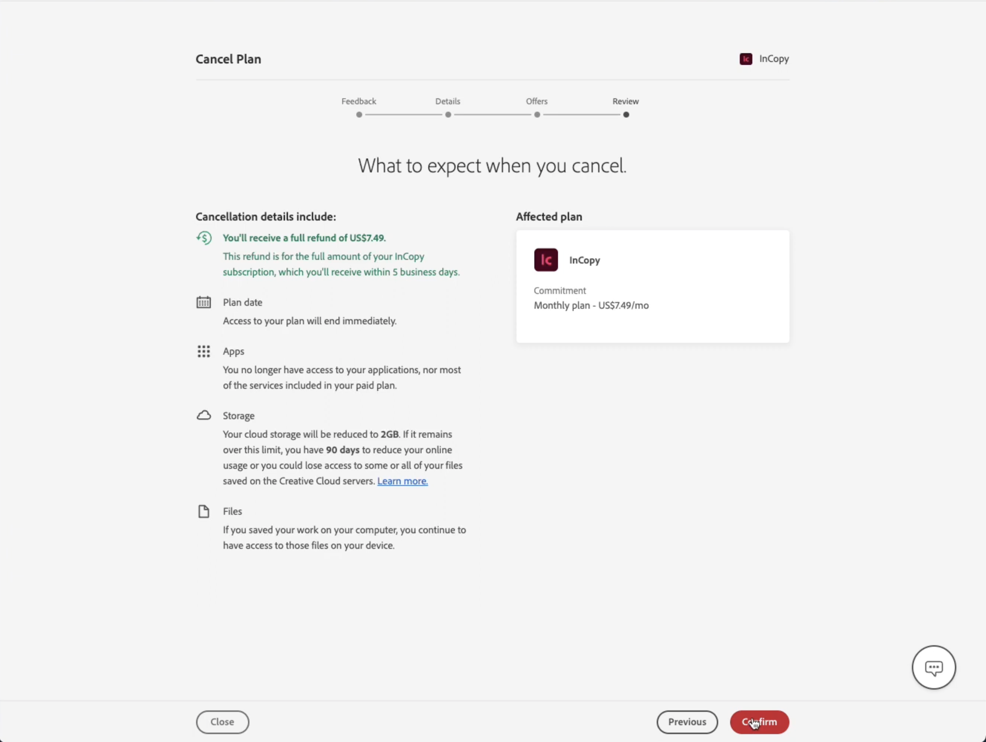
The Review step is also a great touch.
It does a great job of answering the questions users have upon cancellation:
- Will I get refunded?
- Until when will I get access to the account?
- What apps will I get access to?
- What storage will I have?
- What will happen to my saved files?
And it gives users yet another option to rethink their choice to cancel.
Overall, Adobe has one of the best offboarding flows I've seen. If you're looking for inspiration, this is a great source.
Pros
- Loss Aversion
- Churn Reason Survey
- Discount Offer
- Switch Plans
- Support help
Cons
- Little incentive provide detailed feedback
Check out the full video review of Adobe's Cancellation Flow if you're interested in a deep dive into this.
Where To Find Cancellation Flow Templates
I’ve put together three cancellation flow template examples to showcase different scenarios and highlight how you can address user pain points effectively, tailoring solutions for a variety of industries.
These are all available for free in your Raaft account.
Gym Memberships

Gym membership cancellation flows often focus on offering alternatives, such as pausing or freezing the subscription instead of outright cancellation.
This strategy helps address the concerns of customers who may be dealing with short-term issues like travel or injury.
By presenting options that align with their temporary needs, you create an opportunity for them to easily return when ready, reducing churn.

Meal Kit Subscriptions
Meal kit services typically rely on more customized cancellation flows, gathering detailed feedback about why users are leaving - whether it’s due to price, convenience, or menu preferences.

By incorporating solutions like discounts or recipe customization options, companies can directly respond to user concerns and retain customers who may just need more flexibility.

Grocery Delivery Subscriptions
Cancellation flows for grocery delivery services often emphasize convenience by offering pauses or skips rather than full cancellation.

This approach appeals to users who might cancel simply because they don’t need a delivery that week, while ensuring they can easily resume service when it suits their schedule.

I hope these examples provide inspiration. You can adapt these cancellation flow templates to fit your unique subscription service.
All of these templates and examples are ready to use within your Raaft account, so you can start designing effective cancellation flows right away.
Get started with Raaft today. It’s free to sign up!
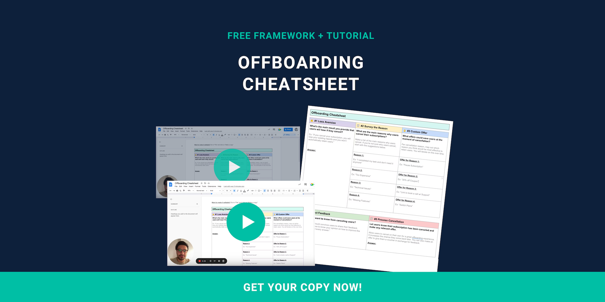
Offboarding Cheatsheet
This framework + video tutorial will help you design a better cancellation process.
Some of our featured articles

Miguel Marques

Miguel Marques

Miguel Marques
Customer Success insights in your inbox
Helping Founders and Customer Success Managers handle customer retention effectively.
We will only ever send you relevant content. Unsubscribe anytime.


